Most companies that invest in a dashboard go through the same arc. The launch meeting is enthusiastic. For a few weeks, managers open it every morning. Then the numbers start to disagree with the figures in the WhatsApp group, someone asks for "just one more chart", the screen grows crowded, and within a few months the dashboard is a page people mention but rarely open. The decisions go back to phone calls and spreadsheets.
The problem is rarely the charting tool. It is that the dashboard was designed around the data that was available, rather than around the decisions people need to make. This article sets out how to design dashboards that become part of how a business is run.
Start with decisions, not data
Before anyone opens a charting tool, sit with each intended user and ask three questions:
- What decisions do you make every day or week? For example: which orders to expedite, which line needs support, which customers to chase for payment, what to reorder.
- What do you look at today to make them? Usually a report, a spreadsheet, a phone call or a walk around the floor.
- What would you do differently if a number changed? If the answer is "nothing", that number does not belong on the dashboard.
This turns a vague request ("we want a dashboard") into a short list of questions the dashboard must answer. Everything else is decoration.
If nobody would act differently when a number changes, it is not a metric. It is wallpaper.
One audience per dashboard
A single dashboard for everyone ends up serving nobody well. Design for distinct audiences:
- Directors and owners need a weekly or monthly view of a few outcomes: sales, margin, cash, on-time delivery, and the exceptions that need their attention.
- Managers need a daily view of their area: today's targets against actuals, open problems, and what is at risk this week.
- Supervisors and teams need a live, simple view of the next few hours: output against target, quality issues, and what to do next.
The same underlying data can feed all three. The level of detail, the time frame and the layout should differ.
Make the numbers trustworthy first
Nothing kills a dashboard faster than a figure people know is wrong. Before building charts, deal with the basics.
Agree definitions in writing
What counts as a "shipped" order: invoiced, loaded or left the gate? Is efficiency calculated on attendance hours or available hours? Write each definition down, agree it with the people who use the number, and show it on the dashboard as a short note.
Use a single source for each figure
Each number should come from one system of record, not be re-typed from several. If the dashboard and the accounts system disagree on sales, accounts should win, and the dashboard should read from it.
Show freshness
Every dashboard should state when its data was last updated. A morning figure presented as live will cause bad decisions.
Fix capture before display
If the underlying data is entered late or incompletely, a dashboard will only display the problem more attractively. Improving how data is captured on the floor or in the office often delivers more value than the dashboard itself.
Design principles that keep dashboards useful
- Few numbers, clearly ranked. Put the most important three to five figures at the top. Detail goes below or one click away.
- Always show a comparison. A number alone means little. Show it against target, yesterday, last week or the same period last year.
- Highlight exceptions. Use colour sparingly, for items that need action, so attention goes where it is needed.
- Let people drill down to the record. A late-order count should open the list of late orders, and each order should open its detail. This builds trust and turns a chart into a work tool.
- Fit the device. A director may check on a phone, a supervisor on a wall screen, a manager on a laptop. Design for the screen that will actually be used.
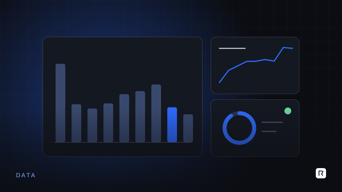
- Prefer simple charts. Bars, lines and tables are understood by everyone. Gauges and 3D effects add little.
Build it into the routine
A dashboard becomes part of the business when it is part of a meeting. Some practical habits:
- Open the morning production or sales meeting with the dashboard on screen, instead of printed reports.
- Assign an owner to each key number, who explains changes and agrees actions.
- Record actions next to the exceptions, so the next meeting starts with what was done.
- Retire printed reports that duplicate the dashboard, once people trust it.
Review and prune
Dashboards accumulate charts over time. Every quarter, check which views are actually opened and which numbers led to actions. Remove what is not used, and ask users what question they still cannot answer. A smaller dashboard that is trusted beats a larger one that is ignored.
A short checklist before you build
- Have we listed the decisions this dashboard supports, for a named audience?
- Is every metric defined in writing and agreed with its users?
- Does each figure come from one system of record?
- Will users be able to see when the data was last updated?
- Can users drill from a number to the underlying records?
- Which meeting or routine will this dashboard be used in, and who owns it?
Where RAED fits
We help businesses define the decisions and metrics first, then build dashboards connected directly to their operational systems, with drill-down to the records behind every number. Where the real problem is data capture, we start there.